HDR (High Dynamic Range) processing
The term “HDR” can invoke a bad connotation with many in the more serious photographer community. HDR refers to High Dynamic Range, and is a technique for getting a wider exposure range that may otherwise not be technically possible with existing camera exposure technology (this could be film or a digital sensor). To outline HDR processing, this is achieved by combining the exposure information from multiple captured images, each at a different exposure level, with the goal to get a more proper exposure across the entire image. Part of this negative reputation for HDR has developed due to an indiscriminate use of this technique by many folks to produce what others in the field would consider garish and otherwise unnatural colors and contrasts. What may look nice as a painting does not necessarily translate as well when being evaluated as a photographic image. I personally worry that the popularity of such techniques if improperly applied in an indiscriminate way could ruin the reputation for digital based photography by distorting the line between what is real versus what is artificially introduced. As computers become more and more powerful, and as image processing algorithms and techniques become more and more sophisticated, there is a danger that some significant population in the public will have a harder time to distinguish a photograph that accurately portrays the scene, the colors, and the lighting as it was versus some artificially enhanced version developed primarily from a computer algorithm.
Now having said that, I do believe HDR processing is a useful and sometime necessary tool for producing an image from a difficult exposure situation. The classic situation would be of a shot that contains a bright sky with a foreground that may be more in shadow. This could be a sunset with a nice foreground like a beach, or it could be from inside a forest with some beams of light shining through. The trick is how to get good results without distorting the colors and maintaining a realistic looking contrast to the scene.
The most popular technique for HDR processing is through the use of the automated tool such as Photomatix designed specifically for this purpose. Other automated tools exist for achieving similar results including through Photoshop via Bridge, but they either have a steeper learning curve or simply have not achieved as much commercial success in the market. In this article, I will describe how to apply HDR processing techniques via two methods: First through Photomatix Pro version 3.2.7, and secondly in a separate article via manual masking layers combined using Photoshop CS5. As you will see, decent results can be obtained either way, and in the authors opinion there is room for both depending on the scene complexity and exposure issues.
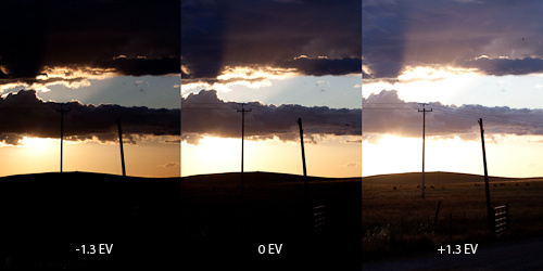
Figure 1 - Original bracketed exposure sequence
The first step as a photographer is to capture your scene using a bracketed exposure sequence with at least 3 images. I have found best results if you capture your images with a separation of at least 1 1/3 stops between each exposure, using RAW, with the camera in aperture priority, on a tripod, image stabilization “off”, manual focus, and manual white-balance. You may need to expand this range if the contrast of the lighting is more extreme. It is important not to disturb the camera in any way between exposures, so a cable release and mirror lock-up mode is preferred to minimize movement or vibration. If you have wind that is causing movement of plant life, or other moving objects like water or people, then results can be more challenging due to the possibility of artifacts as such objects move from one exposure to the next. This is not necessarily a deal breaker, but can mean more work in Photoshop to clean-up such artifacts in order to achieve good results. Movements on higher contrasting transition areas will be the most problematic.
High Dynamic Range processing using Photomatix
To start your HDR processing with Photomatix, you will need to identify a bracketed image RAW file sequence and specify these for loading. You will want to use the unmodified RAW files in order to avoid any confusion or artifacts that the software may otherwise have difficulty with in trying to apply a modified file in a post-processed TIFF or JPG format. After specifying these files, also select options for 'align source images', 'reduce chromatic aberrations', 'reduce noise', and elimination of artifacts due to movement, then click 'OK'. I have found the auto-align does not hurt to generally apply. In some cases it has not been successful if the sequence of images was not aligned properly to begin with, but it does not seem to make matters worse if they already are aligned. Photomatix will churn for some time and then also come up with a window showing a portion of your image. If you move the mouse around this image you will see a magnified version that shows the exposure settings for that localized view. This does not yet reflect the final results, but gives you an idea of how much detail is available to the tool for HDR processing.
After the initial processing, if a quick inspection shows the detail is to your liking and that you don’t have any alignment issues, then click on “Apply tone mapping” to allow Photomatix to proceed. But if the resultant image appears blurry when panned via the cursor, it could be there was some camera movement between exposures or the autofocus was on a changed in the focus point. It could also be that Photomatix tried to improperly align your image based on some local movement. If that is the case, you could try it again from the beginning, this time unchecking the 'align source images' box. If this does not work, then you may not have a good base to start from and have to abandon attempting an HDR effort.
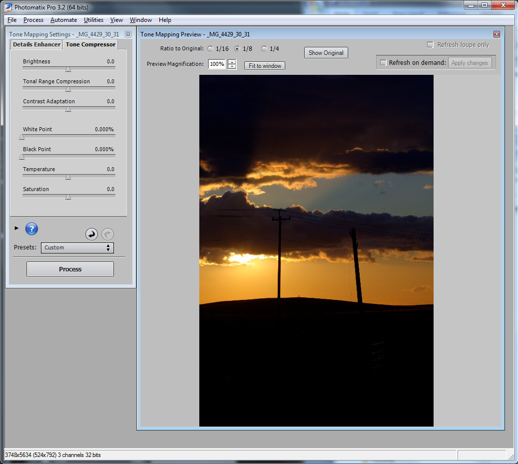
After the first pass analysis processing is completed, you will get a window of the initial results along with a menu with two different tab options: "Detail Enhancer" and "Tone Compressor". The detail enhancer provides you more sophisticated control over what you can do, but also gives you more opportunities to get yourself in trouble. The tone compressor option on the onset gives you a more natural looking result from the color standpoint, but has less flexibility in terms of difficult HDR exposure situations. My general guideline is to start with the tone compressor option first, and see if you can make that work. Keep in mind, that in either approaches, you will want to do a final processing in Photoshop, so there will be more opportunities to clean-up localized exposure or color problems there.
Using the tone compressor option, you can see from the figure below that image has way too much contrast and that many of the subject elements are way too dark.
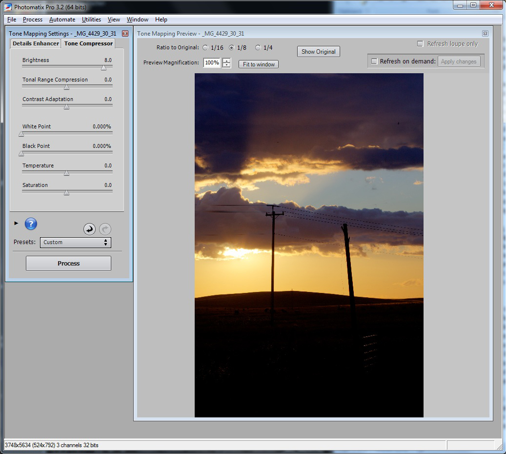
In this case start by adjusting the 'Brightness' slider to the right. In this case I slide this to an '8'. I find in general pushing these control much past this point starts to bring out too much noise. For this image, the result is still too dark, while we are getting more over exposure where the sun is peaking through the clouds. Given the wide exposure range, you will need to make a trade-off how you want to balance this. In this case I believe it is acceptable and looks more natural to have the sun blown out to a small degree.
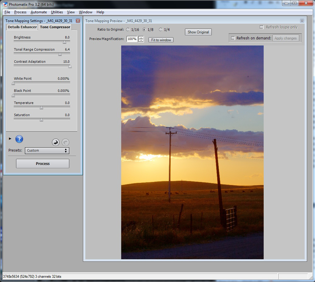
So next we will slide the 'Tonal range compression' slider to squeeze the end points on the scale between light and dark areas. For this image I push this to 6.4, as much further the noise starts to look too noticeable. Given the foreground is still too dark, I now will try reducing the contrast via the 'Contrast adaption' slider, resulting in a setting all the way to the end at '10'. As you will see from the image in the next figure, the foreground is lighter, but in order to achieve this some additional noise was introduced and some the colors in the sky and clouds are starting to look over exaggerated.
This is partially attributed to probably not having a wide enough exposure range in the field when this scene was originally captured. Given this shot is what it is, I happen to like the overall mood and lighting, and I am not as likely to able to retake this scene anytime soon, let's see what we can do to make the best of what we have. In hindsight I may have been better off capturing this over a wider exposure bracket step size such as 1.66 or 2 stop increments.
If you happen to like the tone compressor efforts, you could hit the 'process' button at the bottom to generate a TIF file of the HDR results. But in this case we will attempt to perform the HDR processing via the details enhancer tab of Photomatix instead, the figure below illustrates our starting point with this method.
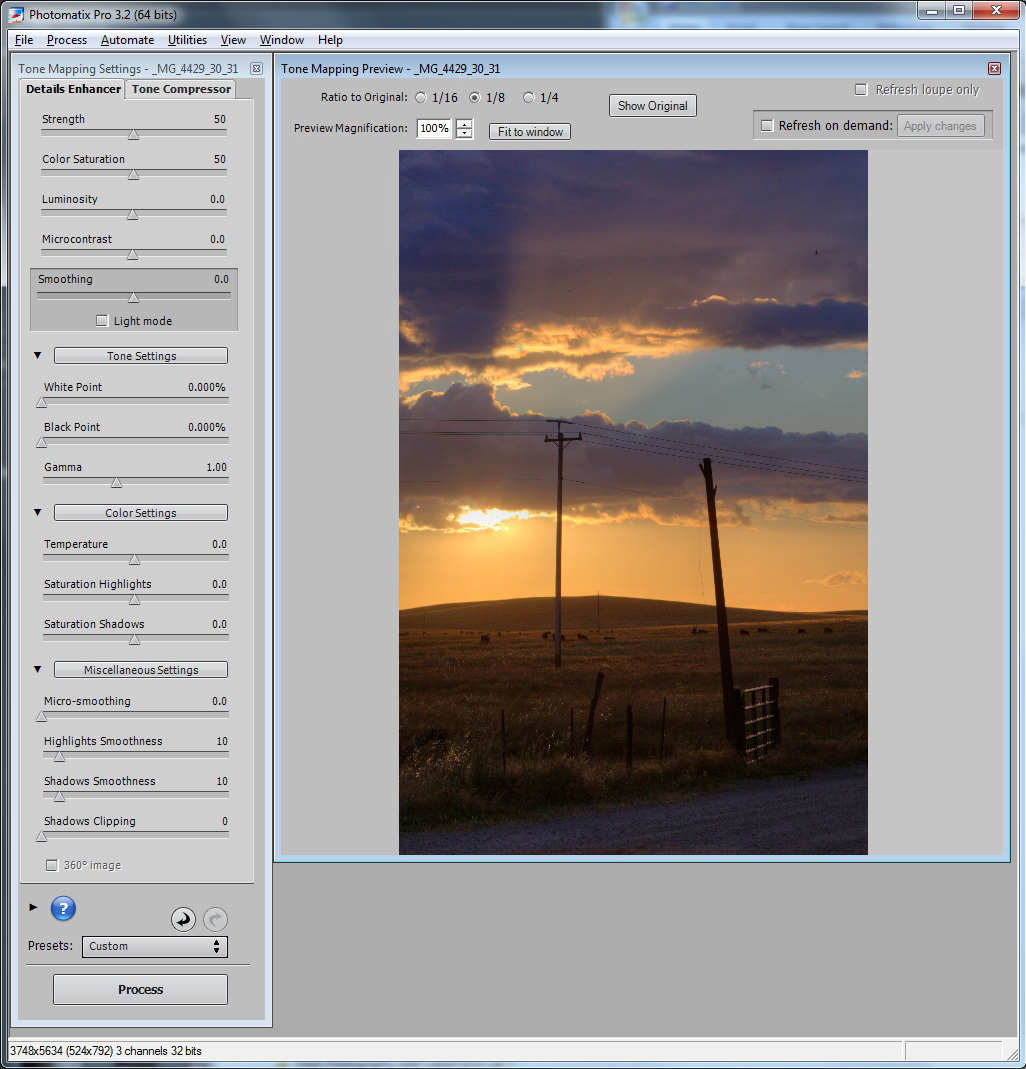
In this case, the details enhancer starting point appears more workable versus the end point from the tone compressor effort. But the colors are garish, the contrast still looks funny, and the foreground is too dark. To try to fix this, we slide the 'Luminosity' slider to the right to 8 to bring up the foreground as shown by the results in the next figure.
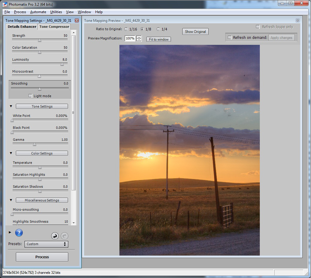
The foreground light level looks better, but the contrast and colors are still funny. So next we will tone down the colors, but try to keep them natural. In this case, we will turn the saturation slider down to 35 as shown by the results below.
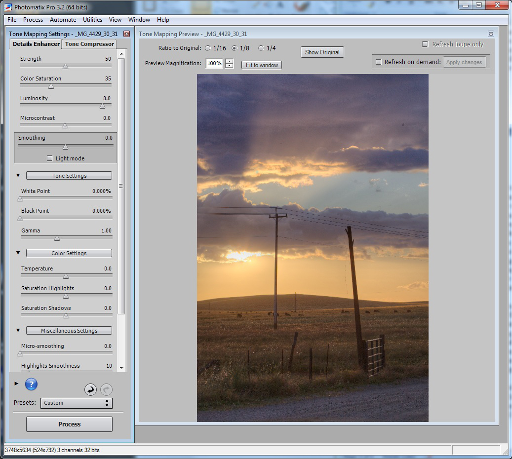
Note we still have a magenta cast in the clouds that look a little too unnatural. But rather than try to do some global adjustment here and potentially sacrifice the orange horizon or gold in the field, we will take care of that later in Photoshop at a more local level. At this point the contrast is still too unnatural looking, so it is desirable to increase this but without losing too much detail on either side of the exposure. There are two controls you could use here: The 'Microcontrast' or 'Smoothing' control. I prefer to start with the smoothing control as increasing the Micocontrast control tends to create an undesirable halo between dark and light exposures areas. This tends to be a dead giveaway of too much or poor post-processing technique, and should be avoided if at all possible. So the results shown in the following figure are based on the 'Smoothing' set to 6.6 to create a more realistic looking contrast for the scene, and leaving the 'Microcontrast' setting at 0.0.
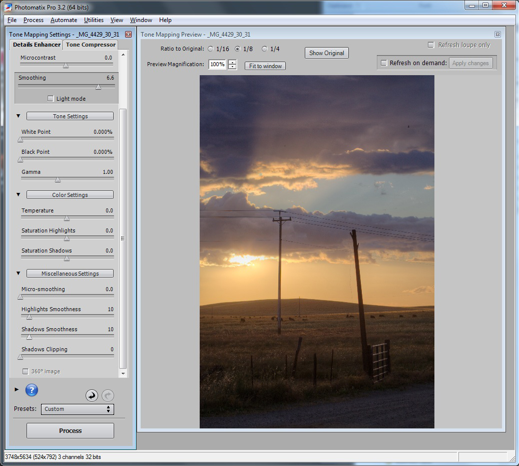
Note that we give up some of the exposure in the foreground again, but the overall contrast of the image is starting to look more natural. We can fix some of this by sliding the 'Shadows smoothness' slider all the way to 0, which does not tend to be as noticeable for halos, while also bringing up the 'Highlights Smoothness' slider to 60 to give the highlights a little more realistic local contrast.
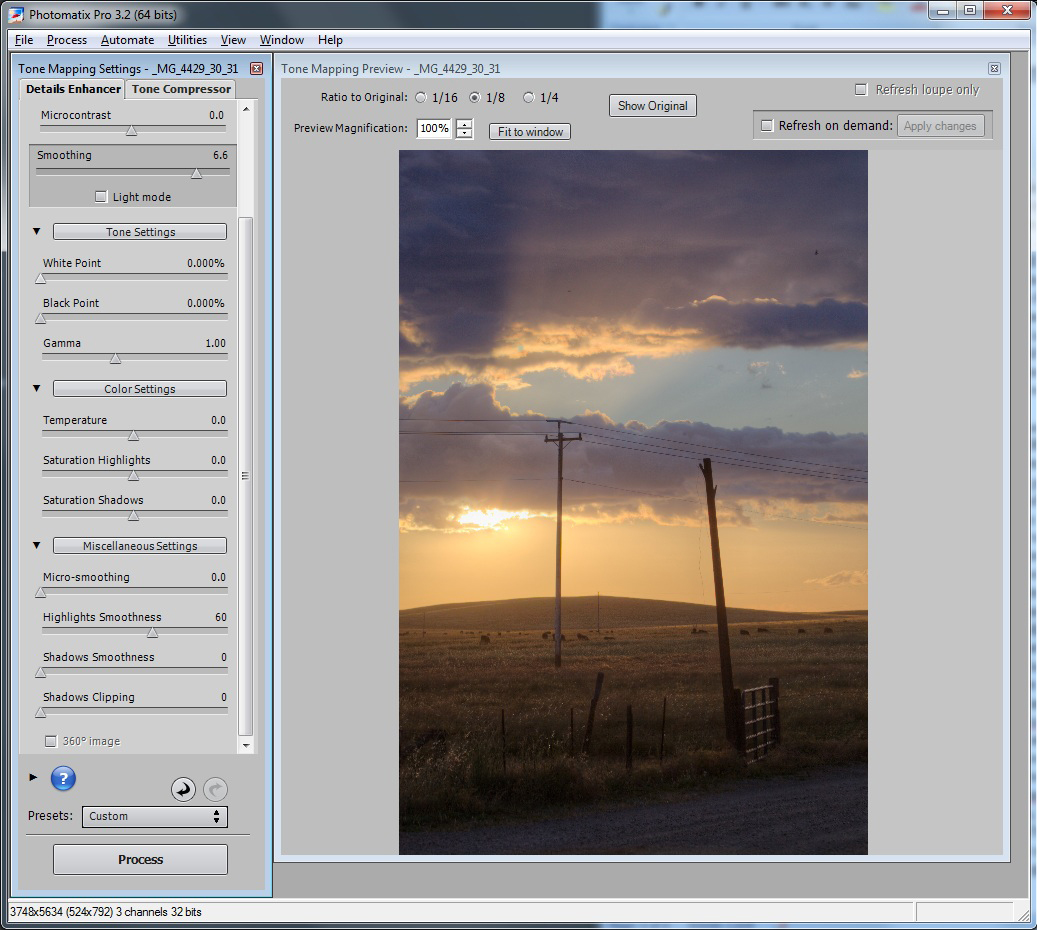
At this point, we may have carried this as far as reasonably possible using the Photomatix tool, but if you step back, the image still looks a little unnatural and the foreground is uncomfortably dark. To fix this, my recommendation is to trade-off some detail of the exposure in the highlights with the sun with that of the shadow detail in the foreground. This can achieved later in Photoshop non-destructively using a level adjust layer, or by simply sliding the 'White Point' slider to the right here in Photomatix. We are now done with further Photomatix processing, and will now hit the 'Process' button to perform the tone mapping step. When that is complete, save the results as a TIF file.
We will now finish the processing of the Photomatix produced work using Photoshop CS5 to perform some localized fix-ups. You will notice, the contrast is still too low as it appears at the starting point for editing in Photoshop.
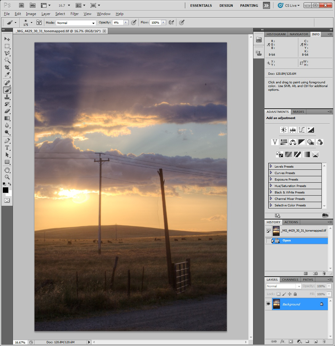
So ironically what we will do is try to undue some of the HDR processing that we just go finished with in Photomatix. The important note here is that it is easier to take away information from the image, then to add it. In this case, Photomatix in a sense created a composite image based on 3 exposures packed into one TIF file. In Photoshop we will try to strip away the content that detracts from the realism, while preserving the beauty of what we originally captured, but were limited by the dynamic range of the camera's sensor technology.
The first step, will be to increase contrast by introducing a curve adjustment layer as shown by the next figure.
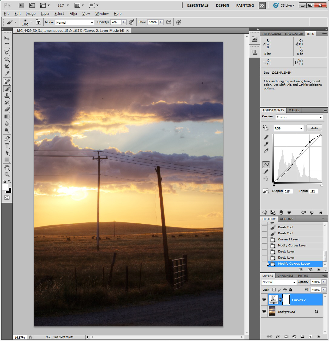
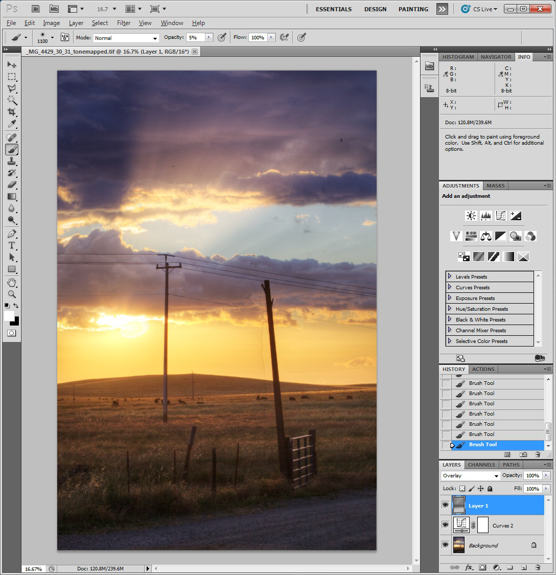
Note that as you increase the contrast, this also tends to increase the saturation of the colors. We should deal with that at the end, but next, we will add a new overlay layer with a 50% gray setting, and use this as a basis to do a non-destructive dodge and burn to better balance the overall image exposure. This is done by doing an Alt right click over the new layer icon, and then selecting 'overlay' as the blending mode, and checking the 50% gray box. Then using white and black brushes (hit the 'D' key to set this) with an opacity of 5%, we paint on this overlay layer using black on areas we wish to darken, and with the white brush the areas we wish to lighten ('X' toggles the brush color). The result of this effort are shown as follows:
Next we will tone down the colors by creating a hue/saturation adjustment layer, pushing the saturation slider all the way down to -40, and then using a black brush with an opacity of 15% to gradually bring back the areas where the color go too muted. In this case I used a gradient layer to get this started since I wanted to preserve all the color in the foreground. The manual brush work was then applied to this mask afterwards. The results of this are shown next.
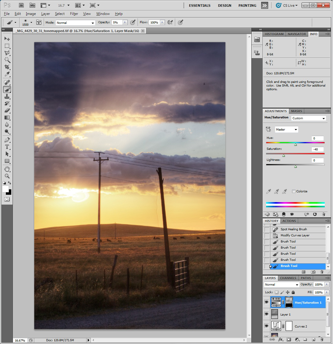
Note we still have an interesting layer of colors here starting with gold, then transitioning to blue, and finally to purple at the top. I happen like this result and can attest it really existed when I captured this image :^). Depending on ones tastes, you could always further mute these colors or adjust them to neutralize any color cast here that you find disturbing using the color adjustment layer.
At this point we are done and you should save your work (excluding sharpening and noise reduction). Given all this Photoshop work was done using adjustment layers, it was non-destructive, so we can always go back and tweak or apply a different recipe after stewing on this some more and getting feedback from others. One problem with working on such an image in isolation for too long is losing your perspective on reality. Having someone unattached to your work to give you some honest feedback can sometimes be a much needed slap of realism. It can also help to simply take a break for a day and then come back and look at the work again with fresh eyes.
In the next article, I will describe a manual HDR processing technique just using Photoshop CS5. You don't have as much control in an automated manner, but I find that can get yourself in less trouble with respect to avoiding the garish HDR look.
If others have additional inputs or learnings on this, feel free to send me an email. Sorry I currently don’t have a blogging capability with this web site, as I am new to web development and learning to do this as I go.
- Stephen Fischer
All content and images are property of Stephen Fischer Photography, copyright 2009, 2010. Last updated: 05/26/2010